
Astro Award · Winter '26
Vote for your Astro Award finalists
Winter '26
Explore each finalist's submitted work below. You can vote for as many finalists as you like. Each finalist can receive one vote from you, and every vote counts as one.
Finalist 01
Ben Hunt
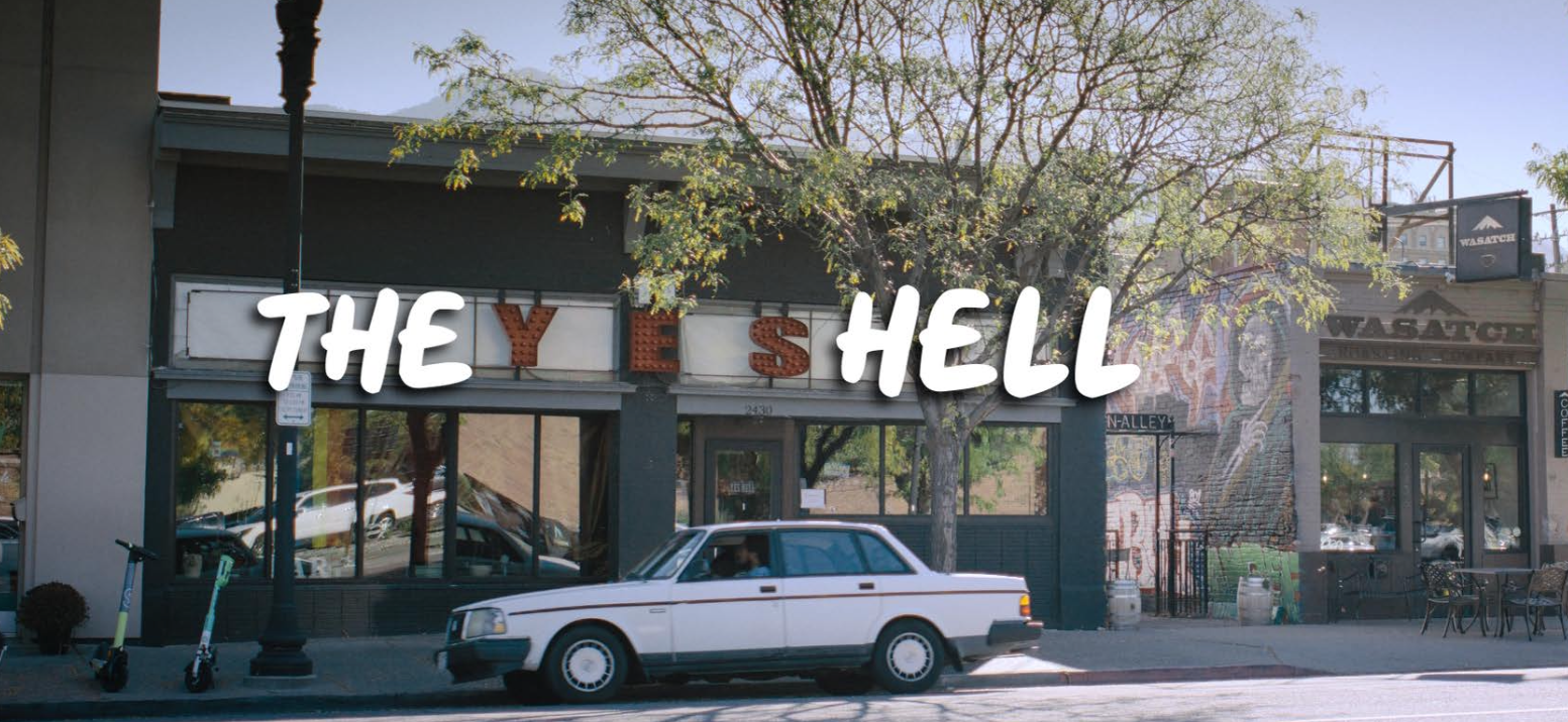
The Yes Hell
It's a short film about an Eric who was denied a PPP loan during the COVID period, and he loses his business, the Spoken Word Poetry Club, "the Yes Hell." He spends the day with his teenage son, struggling to relate to his priorities.
Finalist 02
Amelie Michel
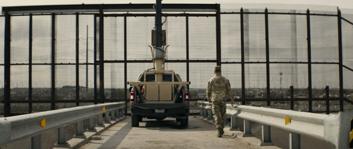
Along the Divide
For the first time, a cinematic documentary takes viewers on an unprecedented journey across the entire 2,000-mile U.S.-Mexico border, capturing the stark realities of migration, policy, and the communities caught in between. Through stunning cinematography and an in-depth investigation, Along The Divide reveals the human cost, political battles, and ever-shifting landscape of America’s most contested boundary.
Finalist 03
Melissa Trottier
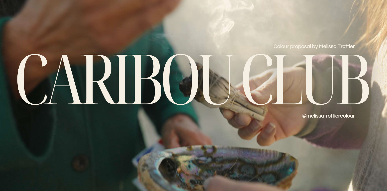
Caribou Club
A short documentary. A land-based, Wolastoqey-owned treaty education and recreation facility nestled on 200 acres of off-grid land outside Fredericton, New Brunswick. Caribou Club is a non-profit space for all ages — where land, culture, and community come together. This documentary follows the women at its heart: teaching, creating, harvesting, and living in honest connection with the earth and each other.
Finalist 04
Dusan Trajkovic
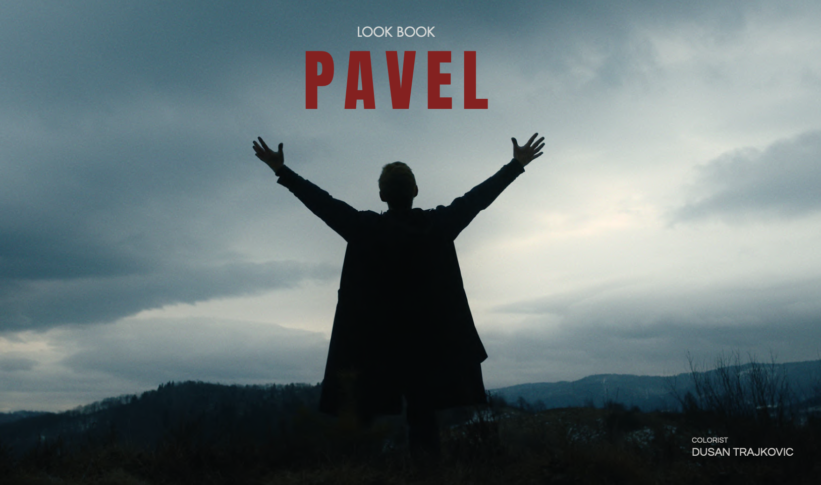
Pavel
Pavel is a film concept developed from an idea inspired by the real life stories of two men who volunteered to fight in the Spanish Civil War. Although their stories were separate in reality, they became the starting point for a single fictional narrative set against the historical events and political realities of Europe. Set in the late 1930s, the film follows Pavel, an idealistic young man from Yugoslavia who refuses to stand aside as Europe moves toward war. When the Spanish Civil War breaks out, he leaves home and sets out for Spain, determined to join the fight for the Republic. His journey across Europe takes him through secret routes, closed borders and repeated arrests before eventually reaching Paris. There, he meets Daphne, a young French woman involved in an underground network helping volunteers reach Spain. What begins as a journey driven by ideals and conviction soon becomes a story of love, sacrifice and determination set against the realities of war. This look book is an exploration of how that story could be translated into a visual language. It brings together references, themes and visual ideas that establish a possible direction for the film's cinematography and look design.
Finalist 05
Wouter De Proost
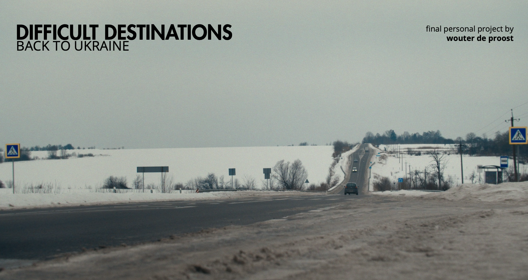
Difficult Destinations - Back to Ukraine
“Difficult Destinations ” has been around since 2013. It’ s a human interest show with a lovable host travelling to countries or specific areas that would otherwise be ignored by regular tourists. It is also one of the first human interest-series I ever worked on. Nine seasons as a post-production assistant, one season as a colorist. For season 10, I was given the freedom to shift the stylistic direction toward a more cinematic approach—though still using the same LUT as the previous seasons. Unfortunately, it's one that packs both the look and the ODT into a single package. This changed with season 11, where I went back to the drawing board and built a LUT that carries elements from season 10 while better matching the heavier theme: Ukraine. I dug deep into the knowledge I'd gathered at the Color Grading Academy and pulled out all the stops for that tormented country. In this document, I will first give you a technical walkthrough before showcasing the actual grade. Hope this will give you a good overview of how this show came to life on a visual level. Belgian critics called it "the best series host Tom Waes has ever made. " Whether the grading qualifies for that same praise, I'll leave up to you all. Slava Ukraini.
Finalist 06
Elisa D'Adda
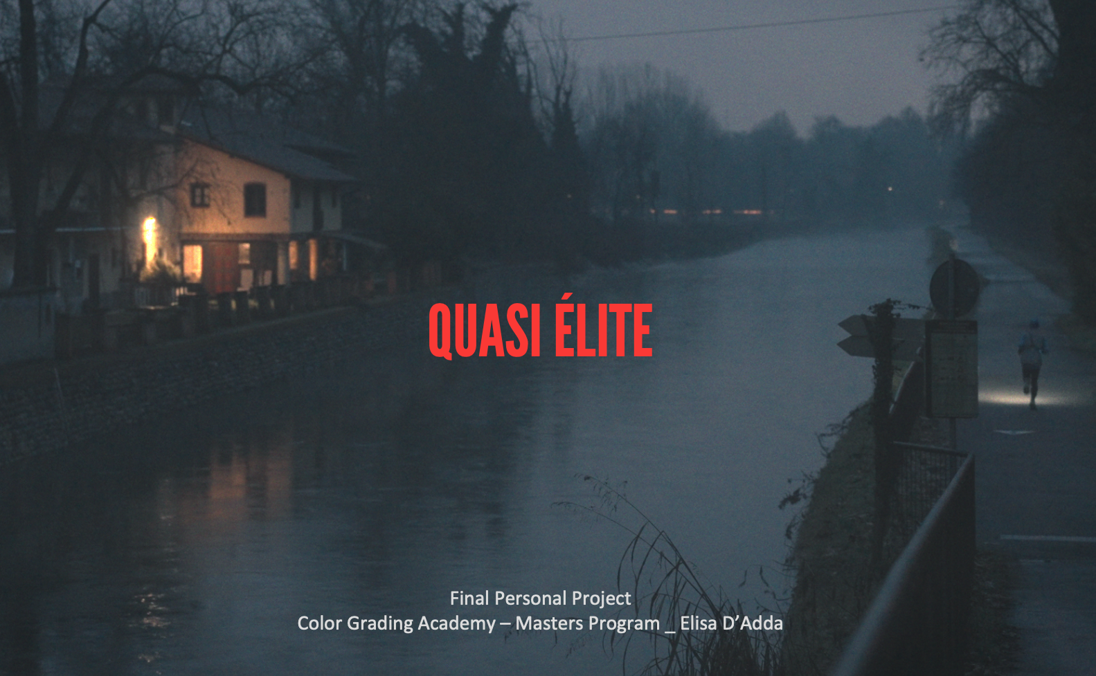
Quasi Elite
Quasi Elite follows Italian marathon runner Andrea Astolfi as he navigates the delicate balance between elite athletic ambition, work and family life. Rather than focusing exclusively on competition and results, the documentary explores the reality of pursuing an extraordinary goal while living an ordinary life. Andrea is not portrayed as an untouchable champion. He is a worker, a father and an athlete trying to compete at the highest level while facing the responsibilities and limitations of everyday life. The documentary moves between race environments, training sessions, industrial workplaces and intimate family moments, creating an emotional and visual landscape for color storytelling. The project was shot using a Sony A7 IV and a DJI Mavic 2 Pro, providing a diverse visual palette across both ground- level intimate moments and large-scale outdoor environments.
Finalist 07
Christian Abi-Aoun
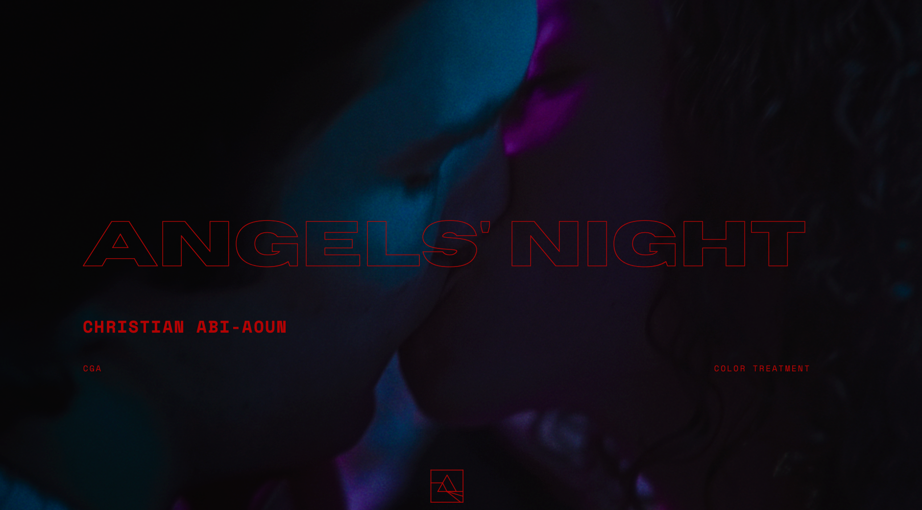
Angel Night
Early in the morning, Alan and Victor drag themselves into a classroom to sit for a make-or-break exam. But the real challenge is not the test itself, but the heavy silence between the two usually inseparable friends. The stolen glances and fragmented memories that drift back during the exam make one thing clear, something happened last night. Blurring the line between comedy and tragedy, Angels ' Night paints a portrait of youth where conflicting desires leave their mark long after the night is over.
Finalist 08
Ethan Hagel
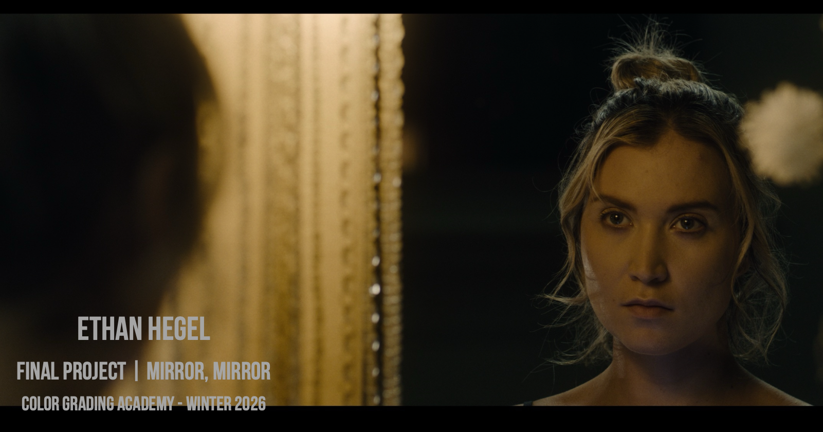
Mirror Mirror
For my final project, I chose to take footage from a feature film that I shot last fall. Mirror Mirror is about a woman’s decent into obsessive madness, as she attempts to retain control over her husband’s life. When Serena finds out that her husband’s ex has come back to town, she obsesses over becoming her in order to win back her husband’s affection. As the director of photography for Mirror Mirror, the director and I used the movie Hereditary (2018) largely as inspiration for the lighting and framing of our movie. Hereditary is mix of looks, depending on the lighting in the scene. Some are rich and contrasty, others are dull and lifted, but regardless there remains a toe in the shadows, and things rarely fall to total black. Ironic warmth often surrounds Serena as she curates her perfect life, regardless of how destructive it may be. IAN VAN DER WALT I Hereditary also uses tilt-shift-style focus effects as part of it’s texture, which I have emulated on the day-for-night establishing shot of the house. This tilt-shift will show Serena’s obsessive vision over her image as she transforms herself. Other textures include visible film grain, con-pop/tex-pop adjustments, and halation. The base for the look is the LUT that I developed in this class. I shot the movie with a different LUT that I made during Summer Look Academy 2022, but I wanted to grade the movie with this new LUT for this project, as it continues to prove robust for a variety of looks, and I understand it more the more I use it, which will inform my creation of future LUTs. This project has been a perfect opportunity to use what I’ve learned in this class in a real-world scenario
Finalist 09
Sebastian Buerkner
Coastal Community Matters
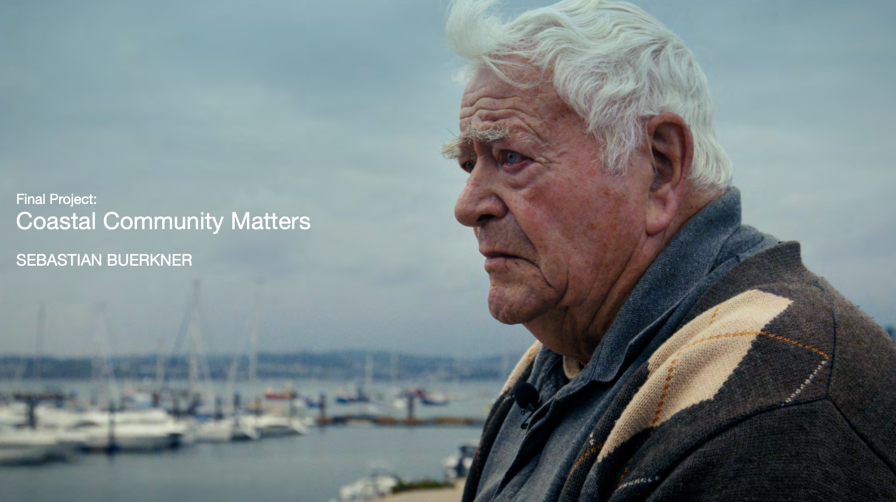
This film is documentary about changes in coastal communities in the face of rising sea levels and in part a promotional, educational film about the installation of a coastal trail, where visitors and locals can listening to the oral history recordings via QR codes. As part of the project intergenerational sessions took place in schools, where older residents shared their heritage skills, stories and memories with children.
Finalist 10
Zach Shapiro
EVmath
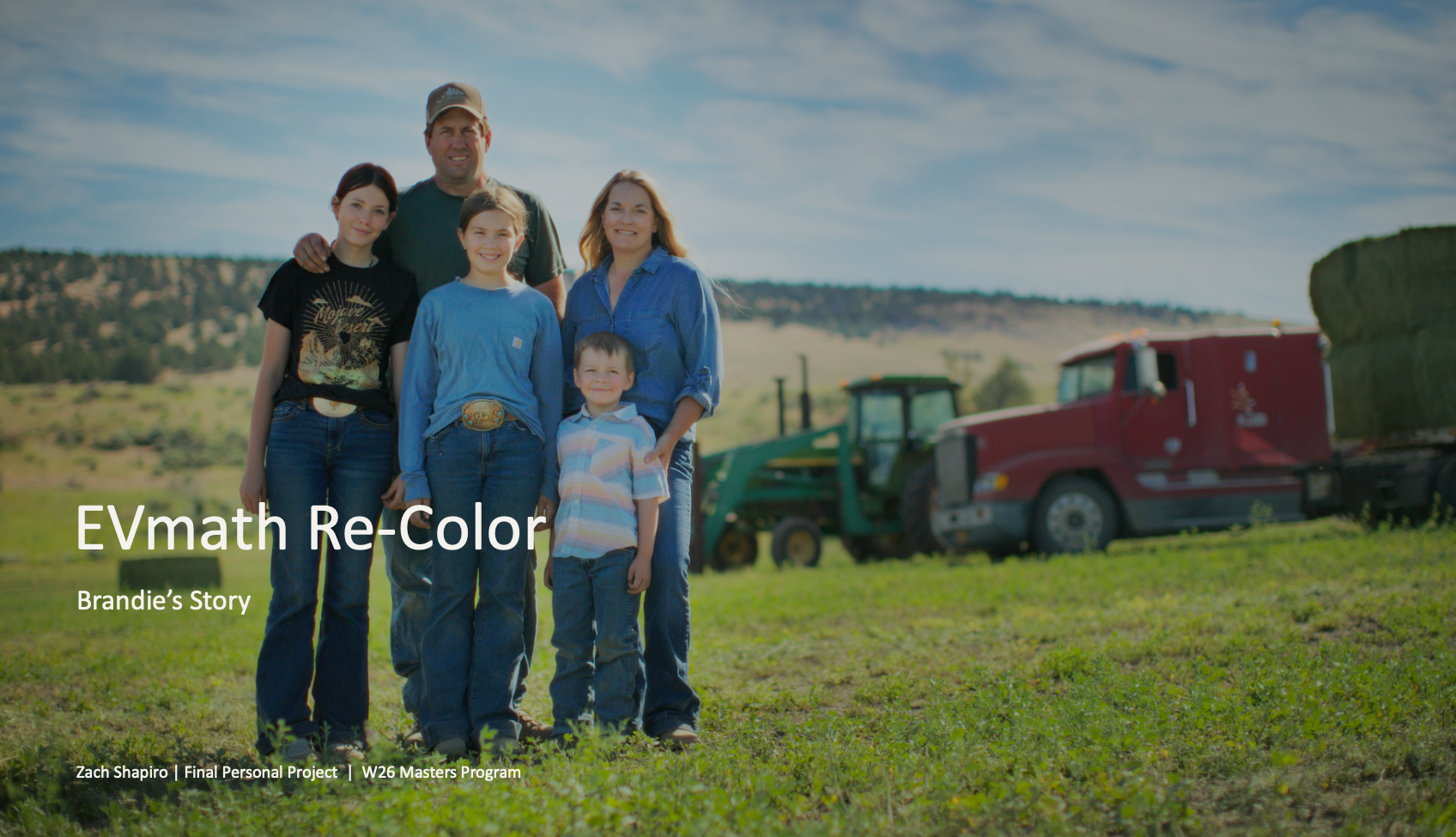
I chose this project because it represents a turning point in my development as a colorist. Although I was initially proud of the original grade, the published films appeared noticeably darker and less saturated than I had intended. That experience exposed gaps in my understanding of color management, monitoring, shot matching, and delivery, and ultimately helped motivate me to pursue the Master’s Program. Returning to the original camera files allowed me to apply what I have learned, measure my growth against my previous work, and build a more intentional grade in which color supports the story without overpowering its documentary authenticity.
Finalist 11
Sergio Cremasco
Io Vivo Altrove
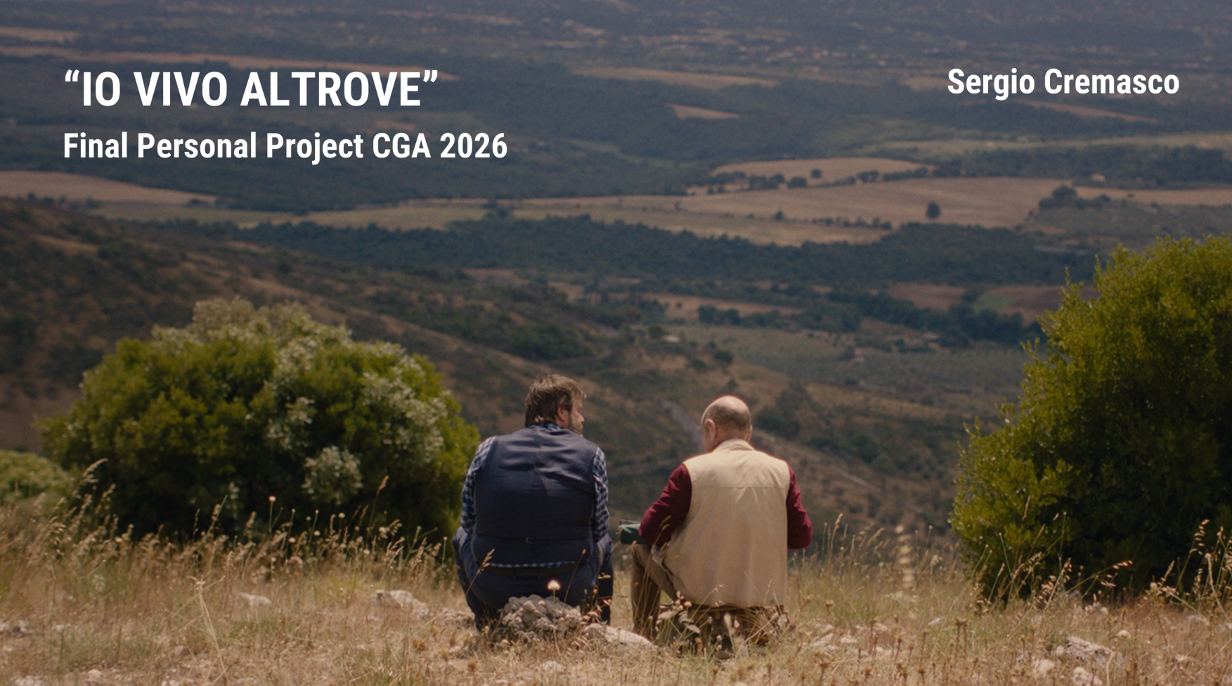
"lo vivo altrove!" is a film that moves between rural comedy, melancholy, and disillusionment. At its core, it tells the story of two men who decide to leave the city behind and search for a different way of living: simpler, freer, and closer to nature. The film is not built on an idealized vision of the countryside. The rural world is not presented as a perfect escape, but as a concrete, physical, and sometimes resistant environment. This contrast between desire and reality is central to the tone of the film. From a color grading perspective, this creates a very specific challenge. The image should remain natural and believable, but it also needs to carry a clear emotional intention. The grade must support the characters' dream of living elsewhere while gradually revealing the imperfections, contradictions, and materiality of the world they encounter. For this reason, the grade avoids a polished or postcard-like rural aesthetic. The visual language is human, grounded, slightly melancholic, and connected to the physical presence of the landscape, the houses, the interiors, and the characters' faces. The creative goal is not to transform the film into something visually stylized, but to give its emotional direction a material form: precise color decisions, consistent density across scenes, and a texture that keeps the surfaces of this world present rather than smoothed away.